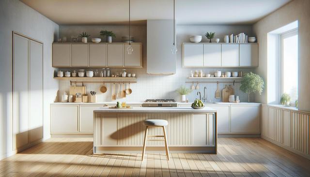
Earthy Tones Take Center Stage
One of the most noticeable shifts in kitchen color trends in recent years is the growing popularity of earthy tones. These natural hues create a calming and grounded ambiance in the kitchen, turning it into a welcoming space for family and guests alike. Colors such as olive green, terracotta, and muted browns are being used on cabinetry, backsplashes, and even walls. These shades work well with wooden textures and stone finishes, enhancing the organic feel of the space.
Designers are using earthy tones to soften the overall look of kitchens, moving away from the starkness of all-white interiors. This trend also aligns with sustainable design principles, as it mirrors the natural world and promotes a more eco-conscious aesthetic. Popular combinations include:
- Olive green cabinets with warm oak countertops
- Clay-toned backsplashes paired with cream walls
- Beige or taupe walls that complement natural stone flooring
These combinations not only feel timeless but also add depth and character without overwhelming the space.
Bold Colors for a Statement Look
On the other end of the spectrum, bold and saturated colors are making a strong comeback in kitchen design. Deep navy blues, forest greens, and even black are being used to make dramatic statements, especially in larger kitchens. These colors are often applied to cabinetry or islands, providing a striking contrast to lighter walls and countertops. This approach adds visual interest and can help define different zones within open-plan layouts.
To balance out the intensity of these colors, designers often incorporate metallic hardware or light-toned countertops. Some effective design ideas include:
- Matte black cabinets with brass handles
- Emerald green islands paired with white marble counters
- Dark blue lower cabinets topped with light wood shelves
These bold choices are ideal for homeowners looking to infuse personality and sophistication into their kitchens without sacrificing functionality.
Soft Pastels for Light and Airy Spaces
Soft pastels continue to hold a place in kitchen color trends, particularly in smaller spaces where light and openness are priorities. Shades like mint green, pale blue, and blush pink offer a refreshing alternative to neutrals. These colors can make a compact kitchen feel more spacious and cheerful, reflecting natural light and creating a soothing atmosphere.
Pastels are often used alongside white or light gray to maintain a clean and uncluttered look. This is particularly effective in minimalist or Scandinavian-inspired kitchens. Some popular pastel pairings include:
- Pale blue cabinets with white subway tiles
- Mint green walls with light gray countertops
- Blush pink accents with natural wood finishes
Using pastels can also help ease the transition between kitchen and adjoining living spaces, especially in open-plan homes where cohesion in design is important.
Neutral Foundations with Accent Colors
Neutral color palettes remain a mainstay in kitchen design due to their versatility and timelessness. Whites, grays, and beiges provide a reliable foundation that can be easily updated with accent colors through accessories or small design elements. This trend appeals to homeowners who prefer a clean and classic look but still want the option to introduce color without committing to a complete overhaul.
Adding pops of color through open shelving, bar stools, or decorative items allows for seasonal or trend-based updates. Some simple ways to incorporate accent colors include:
- Swapping out cabinet handles for colorful ones
- Using brightly colored small appliances
- Incorporating colorful artwork or tile backsplashes
This flexible approach makes it easy to refresh the kitchen’s appearance without major renovations, all while keeping the space cohesive and functional.
Two-Tone and Color Blocking Techniques
Two-tone kitchens and color blocking are becoming increasingly popular as a creative way to add dimension and contrast. These techniques involve using different colors for upper and lower cabinets, or combining contrasting hues on walls and islands. This approach adds visual intrigue and allows for greater customization in kitchen design.
Common two-tone combinations include darker colors on lower cabinets with lighter tones above, which helps ground the space while keeping it bright. Color blocking can also highlight architectural features or create focal points. Examples of effective color blocking include:
- Charcoal lower cabinets with white upper cabinets
- Navy and light wood cabinetry combinations
- Boldly colored islands contrasted against neutral surroundings
These strategies cater to those who enjoy a dynamic and personalized kitchen aesthetic, providing a modern twist on traditional layouts.
Conclusion: Creating a Kitchen That Reflects Your Style
Choosing the right color palette for your kitchen is about more than just following trends—it’s about creating a space that suits your lifestyle and taste. Whether you prefer the serenity of earthy tones, the drama of bold hues, or the charm of pastels, there’s a trend to match every vision. By blending color with thoughtful design, you can create a kitchen that feels both current and uniquely yours. Keep in mind that color has the power to transform not just the look of your kitchen, but also how you feel in it.
Leave a Reply